
Odd Memes
Design Lost (デザインが負けた): when pretty design makes people get lost
A Japanese critic's phrase for stuff that looks stylish but leaves the people actually using it totally lost.
 AI doodle
What does this meme mean?
- Meaning
- How it's used
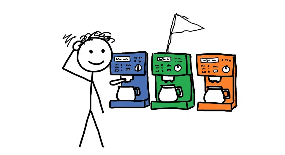
AHow do I pick this coffee machine?
BRight? Design totally lost. I can't tell if the 'R' means right or large.
- When it took off
- It's an entry on Japanese Wikipedia, and it spread through people in the design industry. Seven Café's coffee machine and convenience store private-label packaging are the go-to examples.
Where it came from
This isn't an academic term or an official standard. It's a playful jab at designs that look great but leave users confused or unable to find the function they need.
The classic example is Seven Café's early coffee machine. The 'R' and 'L' marking the cup sizes were printed so small that people mixed them up as right and left. The stores ended up taping on labels like "regular size," and the clash between the clean machine body and the patchy notes made it a symbol of "design lost."
Public signage and convenience store private-label packaging have similar stories. Everything looks neat, but you can't tell where the item you want is or what's what. That's why the phrase still gets pulled out whenever someone wants to roast pretty-but-useless design.